Course Lesson 6 of 11
Layout and grids
Course progress 0 of 11 complete
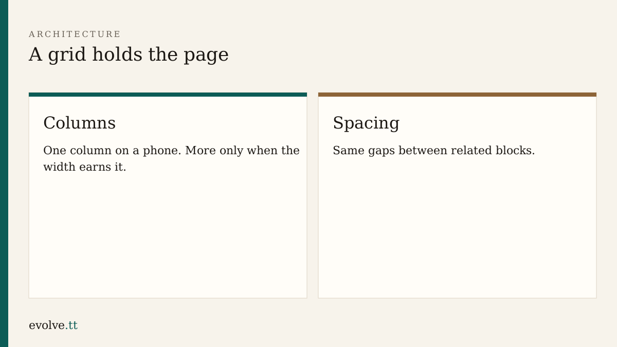
Wireframes named the blocks. This lesson places them with CSS in styles.css.
Start with flow
Section titled “Start with flow”Before grids, get vertical rhythm:
:root {  --gap: 1rem;  --measure: 40rem;  --ink: #1b1713;  --paper: #f7f3eb;}
body {  margin: 0;  font-family: system-ui, sans-serif;  line-height: 1.5;  color: var(--ink);  background: var(--paper);}
main {  max-width: var(--measure);  margin: 0 auto;  padding: var(--gap);}
section + section {  margin-top: calc(var(--gap) * 2);}
max-width stops lines from stretching across a wide monitor. Neighbours reading on a phone never notice the variable names; they notice whether the text wraps sensibly.
When a grid helps
Section titled “When a grid helps”A services list can become two columns on a wide screen:
.offer-list {  display: grid;  gap: var(--gap);}
@media (min-width: 40rem) {  .offer-list {    grid-template-columns: 1fr 1fr;  }}
If the second column forces awkward reading order, stay on one column. Layout serves the brief, not a template gallery.
Header and footer
Section titled “Header and footer”Keep the nav in a simple flex row that wraps:
header nav { display: flex; flex-wrap: wrap; gap: var(--gap);}Do not hide the nav behind an icon for this course. Three links can stay visible.
- Link
styles.cssfrom every HTML file if any link is missing. - Add the base CSS above. Refresh Home on a phone-width window.
- Mark the services list with
class="offer-list"and add the grid rule. - Widen the window past 40rem. Confirm the list gains columns without overlapping the nav.
- Note in
notes.mdwhich sections stay one column on purpose.
Before you continue
You are ready for Colour and type when:
- all pages share
styles.css - phone width stays one readable column for main text
- at least one intentional grid or flex choice is written down
Mark this lesson complete when those three are true.