Course Lesson 9 of 11
Responsive states
Course progress 0 of 11 complete
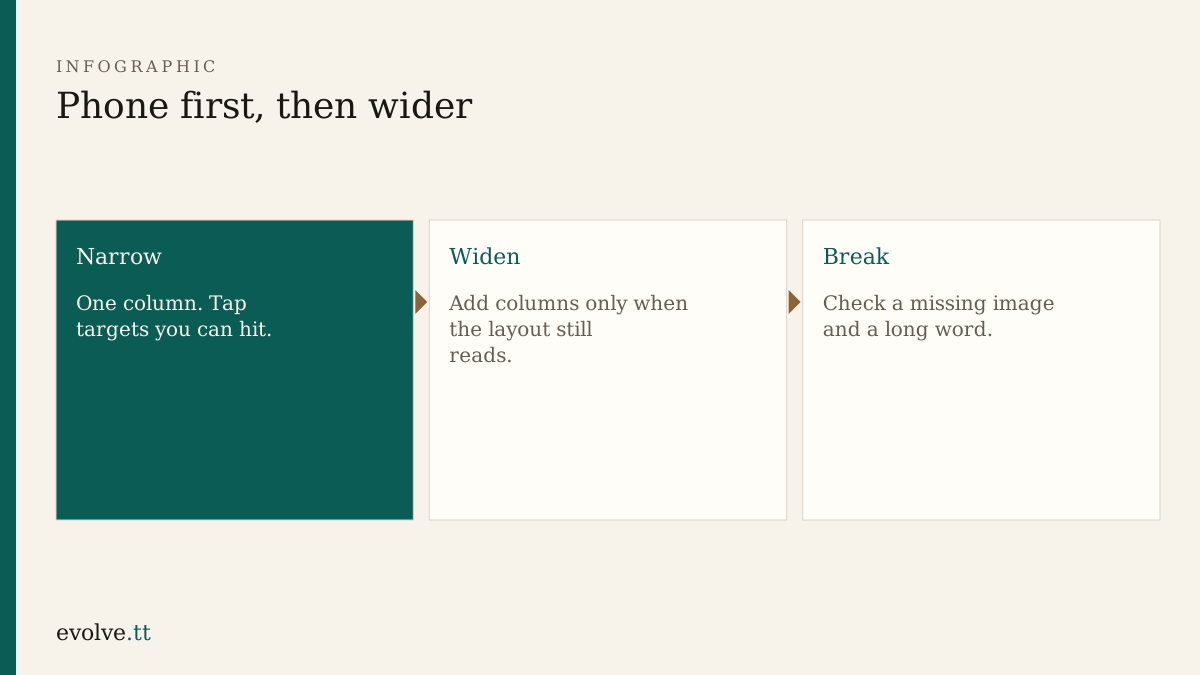
Copy is in. This lesson tries to break the pages on purpose so a visitor does not find the break first.
Widths to try
Section titled “Widths to try”In browser developer tools, or by dragging the window:
- ~320–390px wide (phone)
- ~768px (tablet-ish)
- ~1200px (desktop)
You are not collecting analytics. You are asking: can I read this, tap this, and move to Contact?
Failure states worth five minutes
Section titled “Failure states worth five minutes”- Long word — add a long email or URL; ensure it wraps (
overflow-wrap: anywhereon body or links). - Missing image — if you added an image, remove the file temporarily; the
alttext should still explain it. - Empty offer — hide one list item; the layout should not leave a strange gap that looks like a bug.
- Zoom — increase page zoom to 200%. Text should reflow, not clip.
What not to chase
Section titled “What not to chase”Perfect pixel match across every device brand is out of scope. So is a hamburger menu animation. Three visible links and a stable column are enough success for version one.
- Walk Home → Services → Contact at phone width. Fix any nav or spacing issue.
- Repeat at desktop width. Confirm your grid choices still match
notes.md. - Force a long contact string and fix wrapping if the page scrolls sideways.
- List three fixes you made in
notes.mdunder “Responsive checks”. - Optional: ask an assistant for other failure cases, then try only one that fits a three-page static site.
Before you continue
You are ready for Developer handoff when:
- phone and desktop widths both work for all three pages
- at least one failure state was tested
- responsive notes exist outside the chat
Mark this lesson complete when those three are true.